books
covers
Illustration
ABOUT
School visits
Fun
process
BUY PRINTS
Menu
books
covers
Illustration
ABOUT
School visits
Fun
process
BUY PRINTS
prev
/
next
Back to books
0
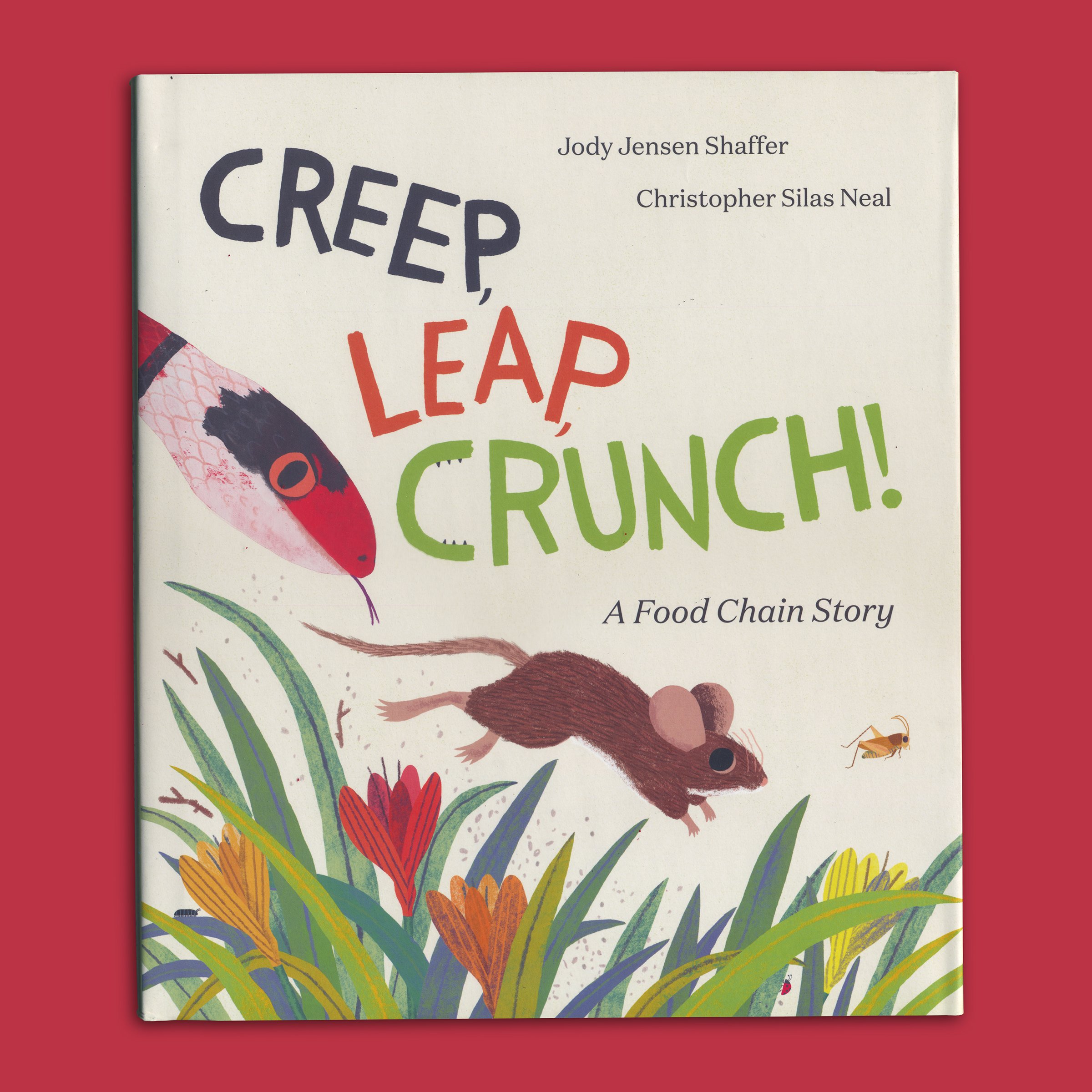
creep-leap-crunch
0
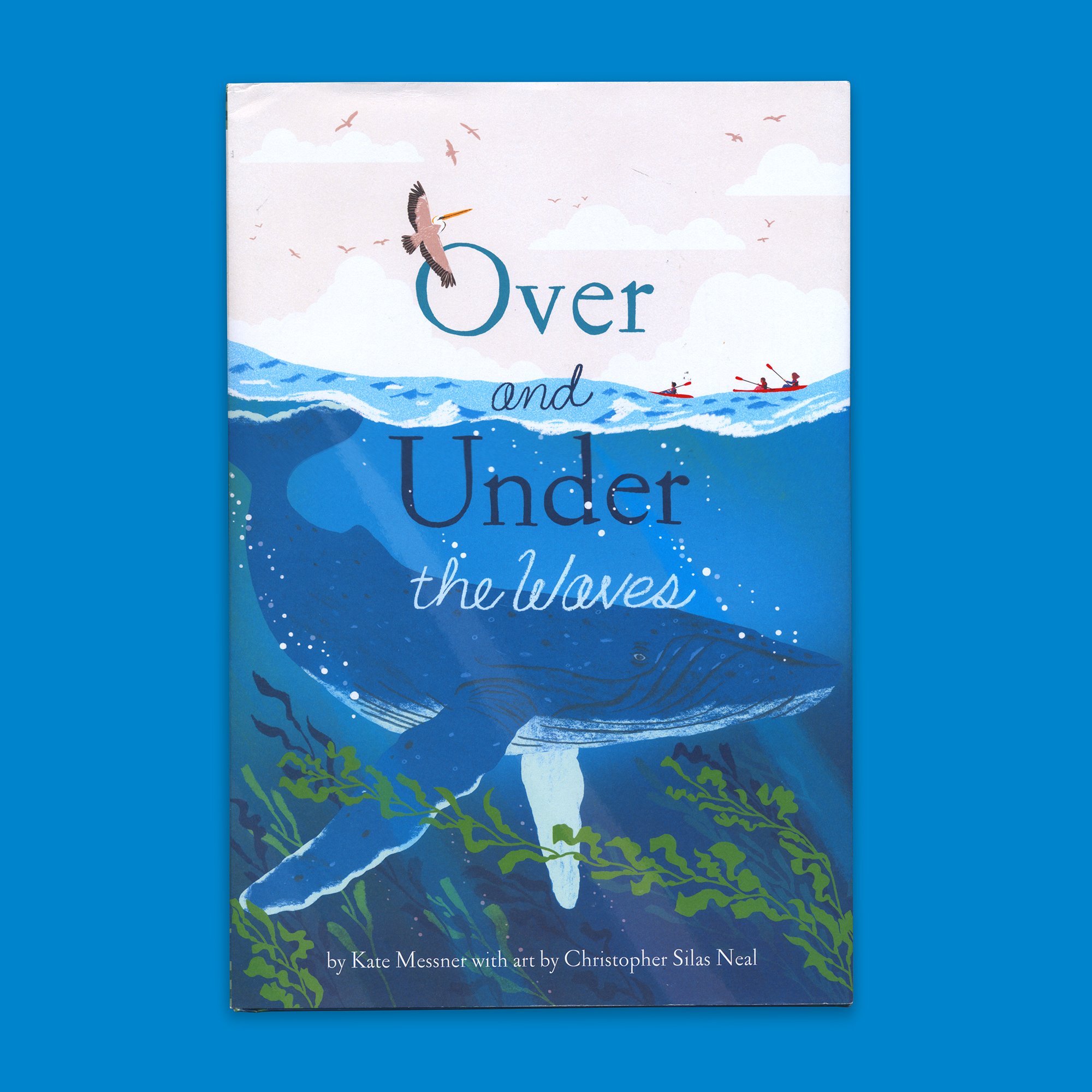
Over and Under the Waves
0
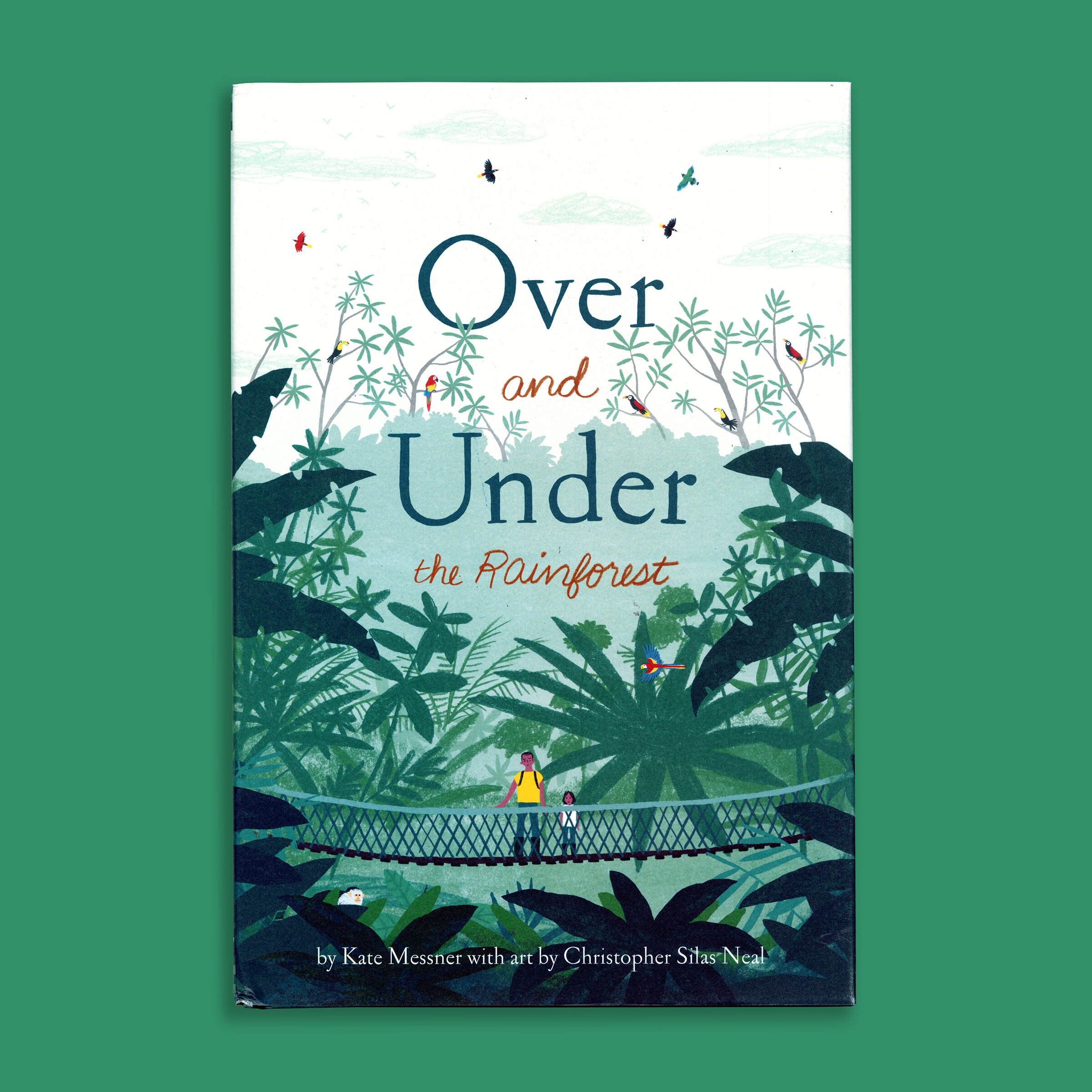
rainforest
0
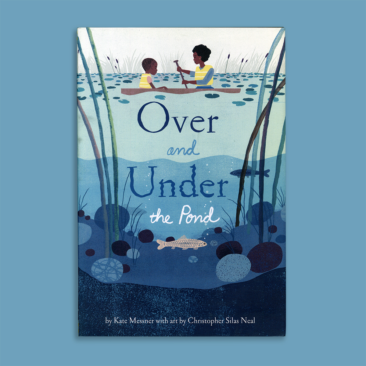
pond
0
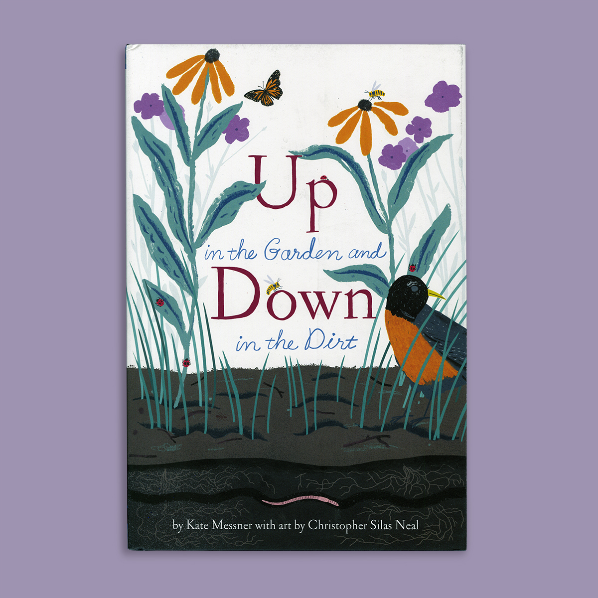
Garden
0
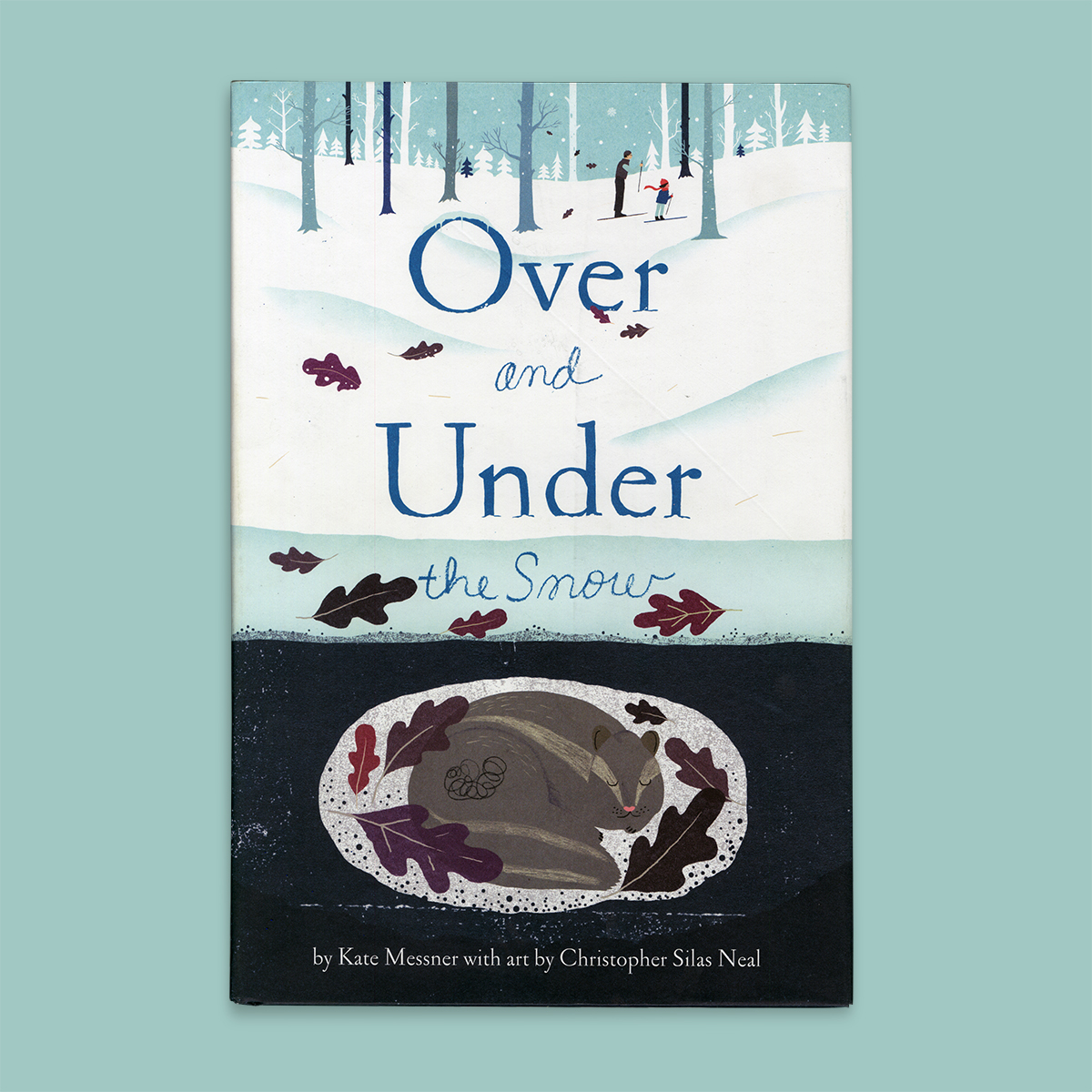
snow
0
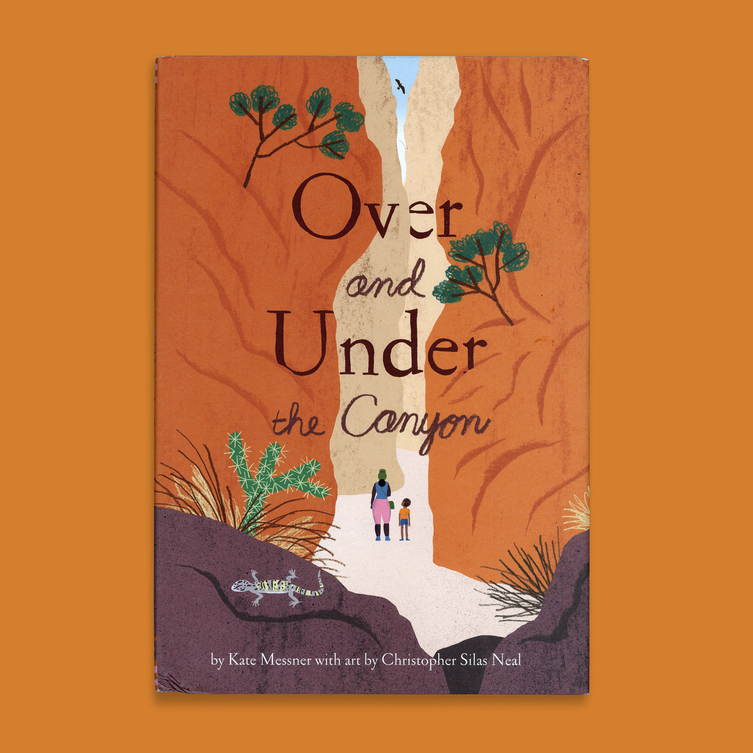
Canyon
0
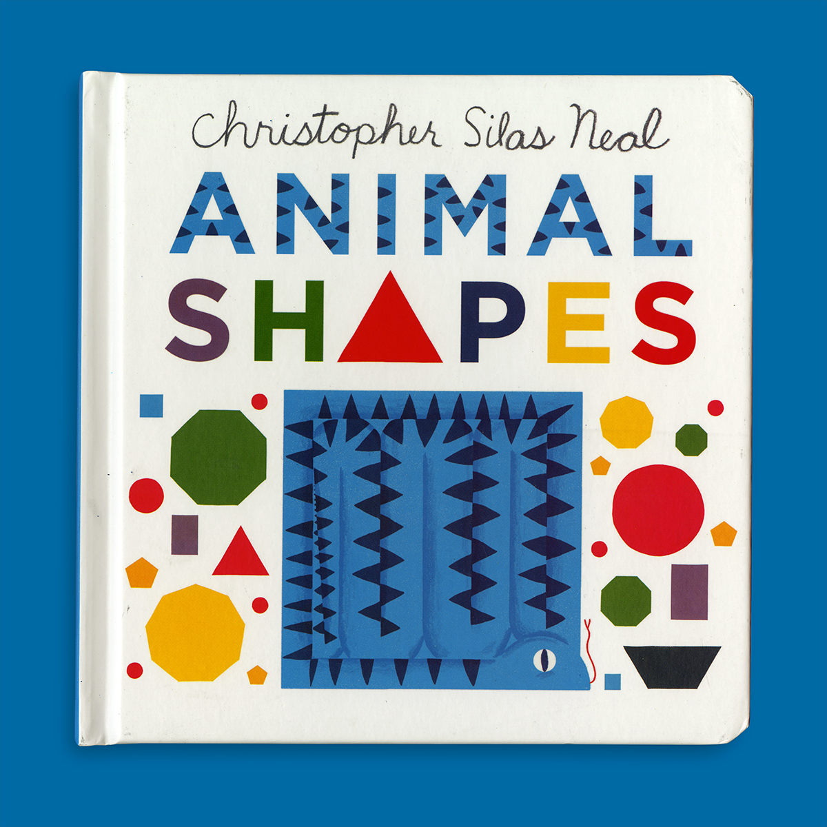
animalshapes
0
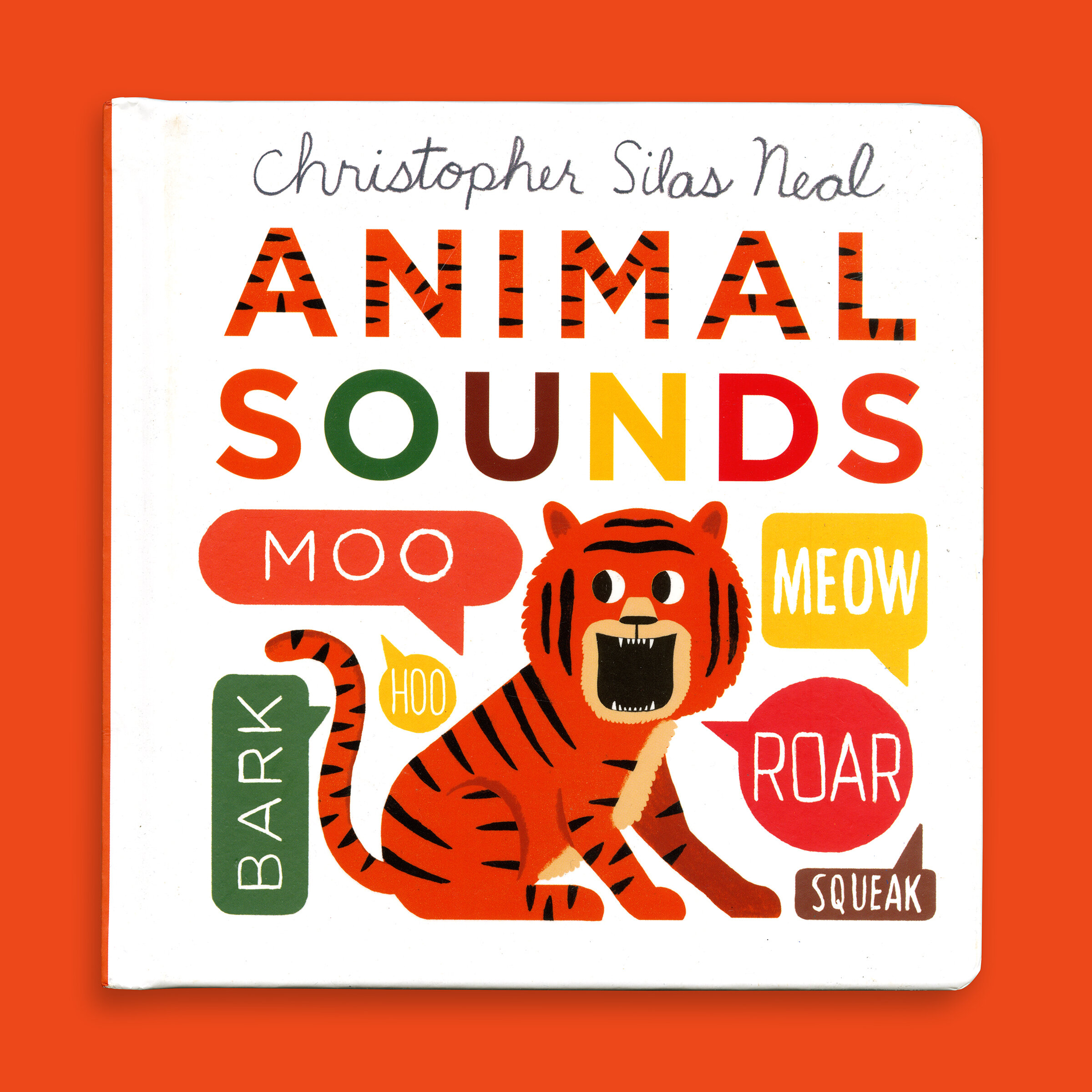
animal sounds
0
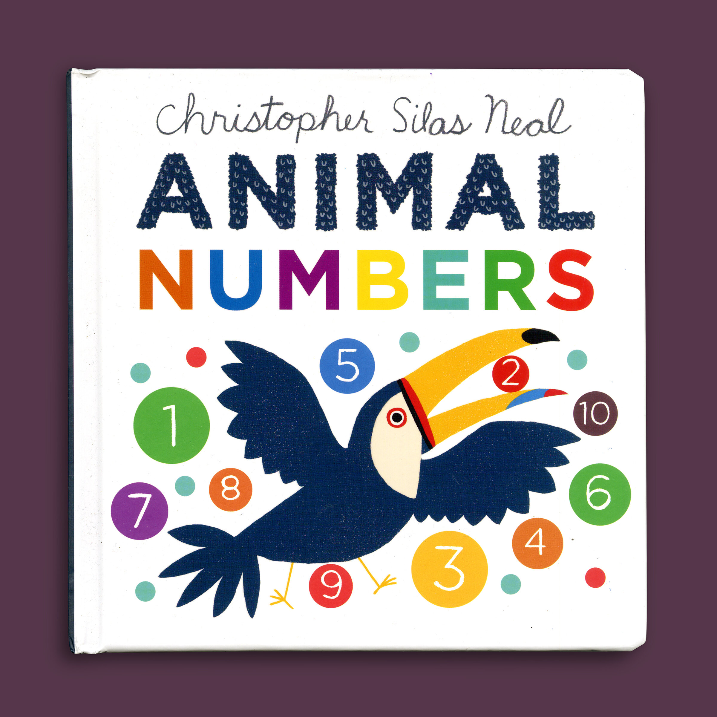
animal numbers
0
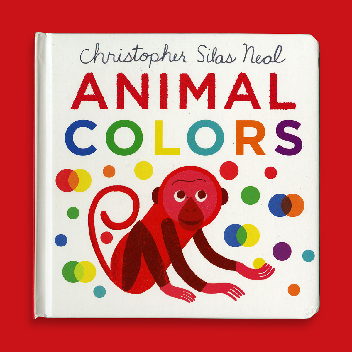
animalcolors
0
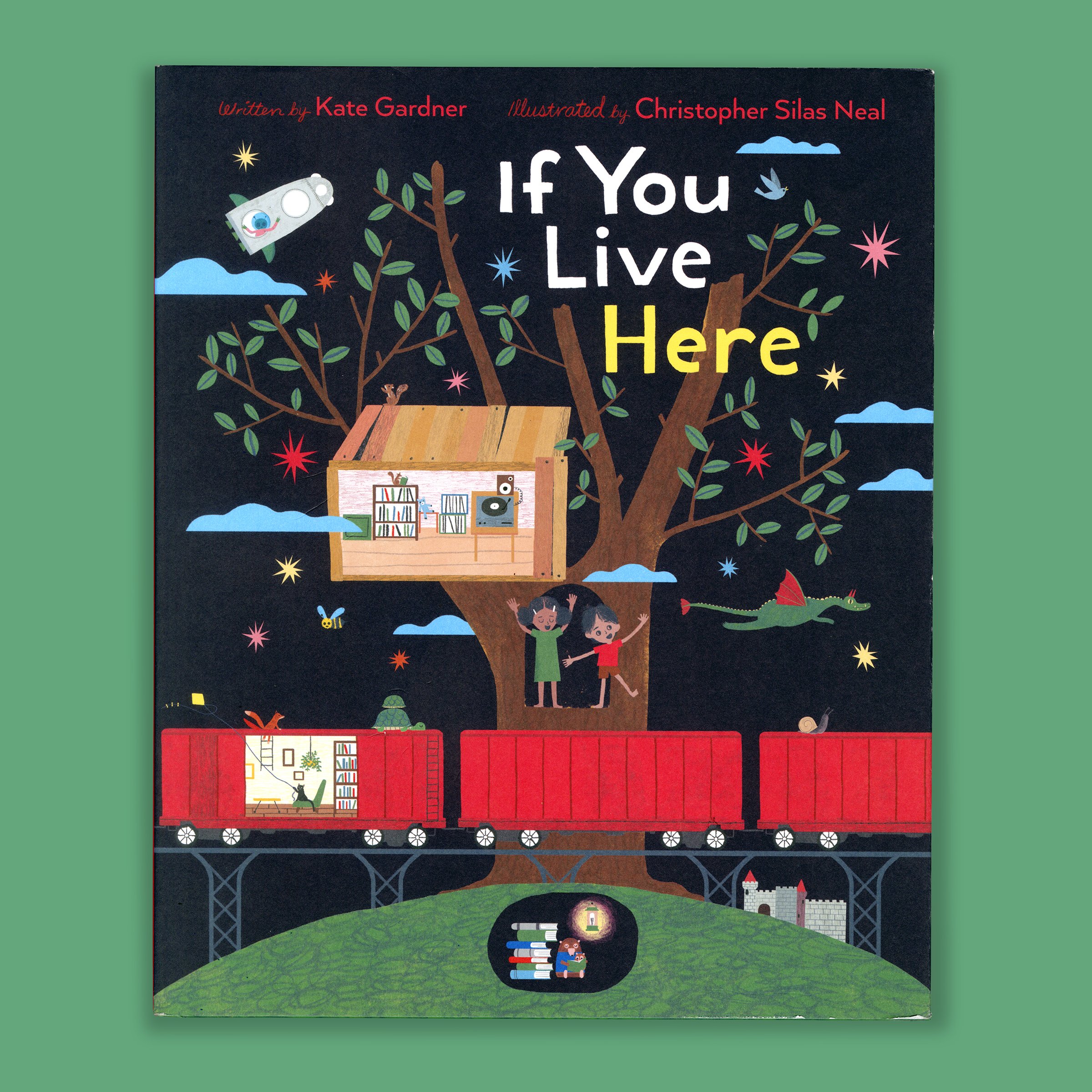
live here
0
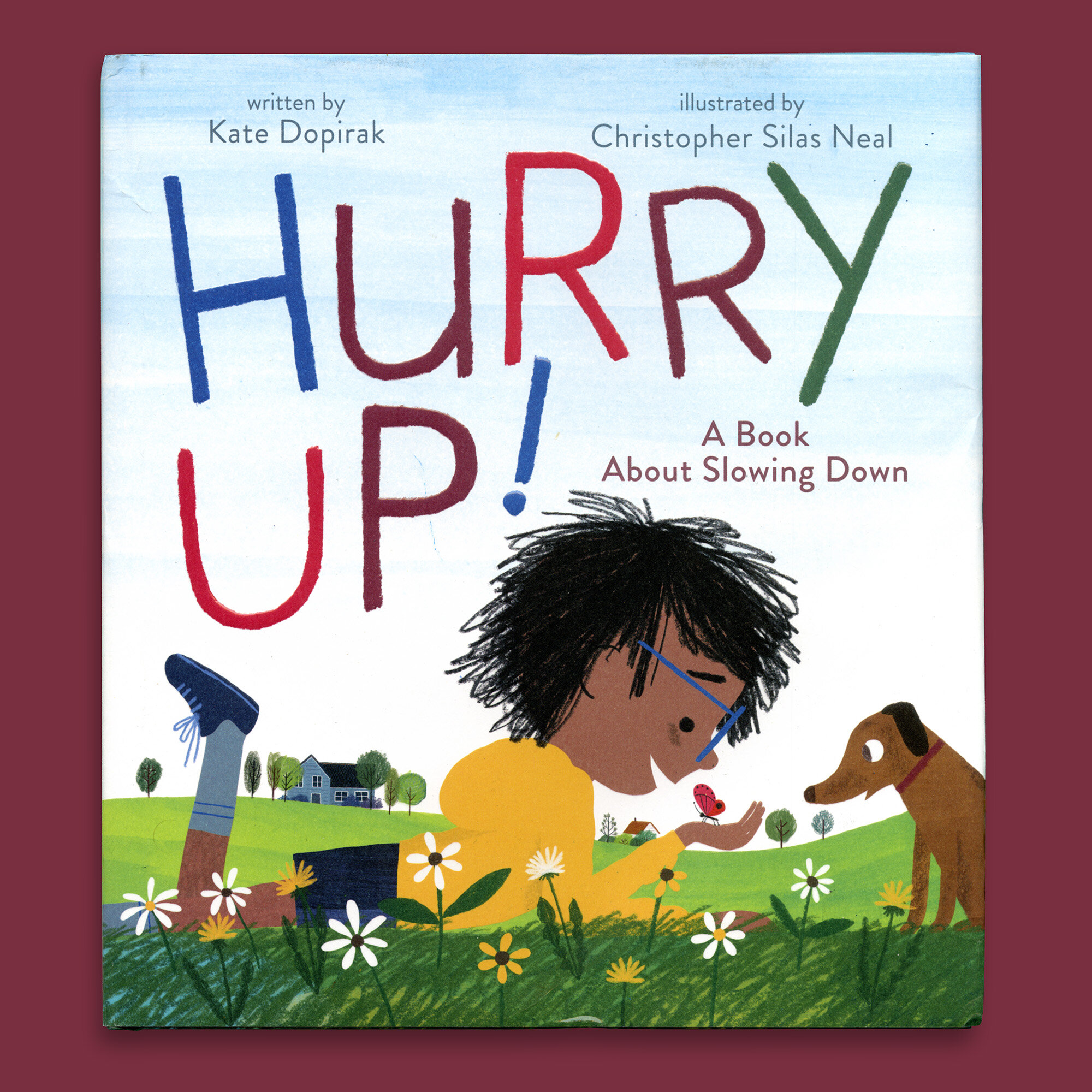
HURRY UP
0
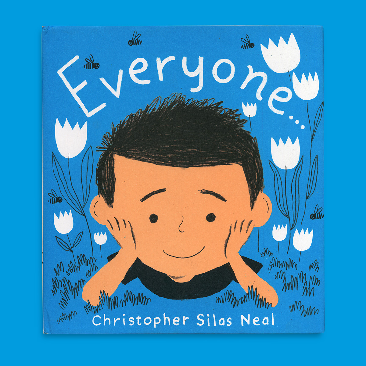
Everyone
0
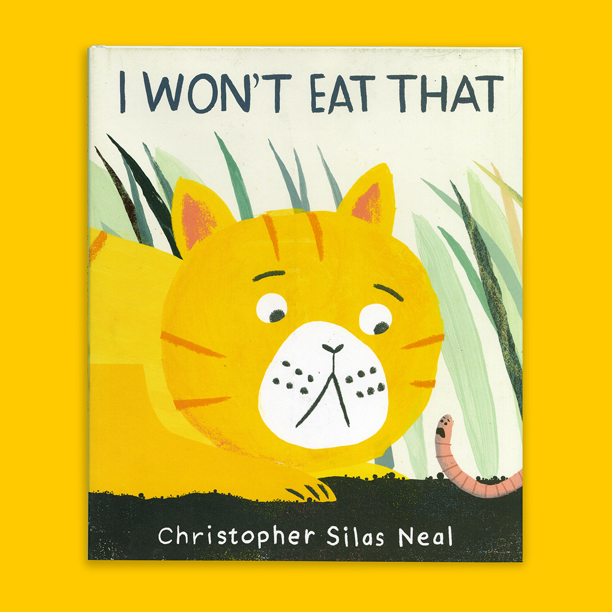
eat
0
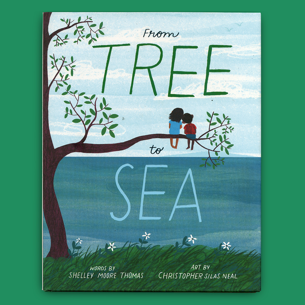
Tree to Sea
0
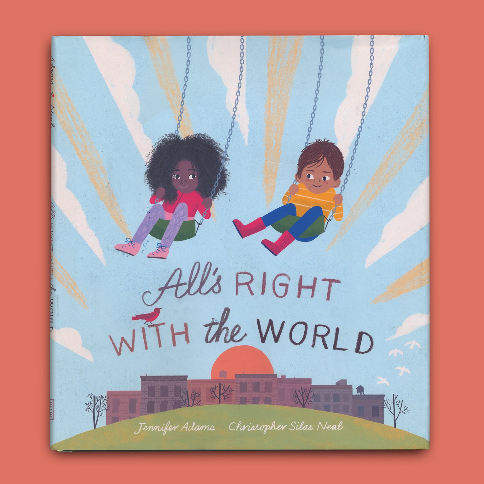
allsright
0
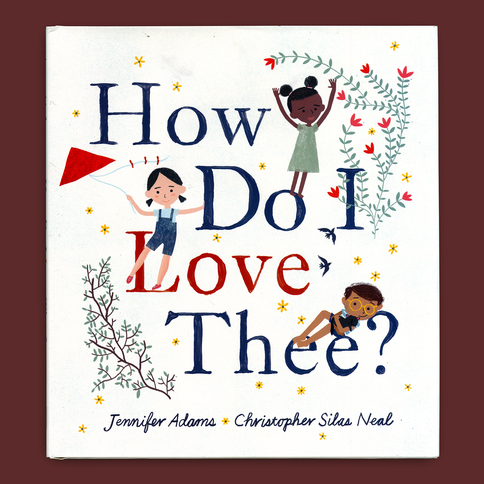
Lovethee
0
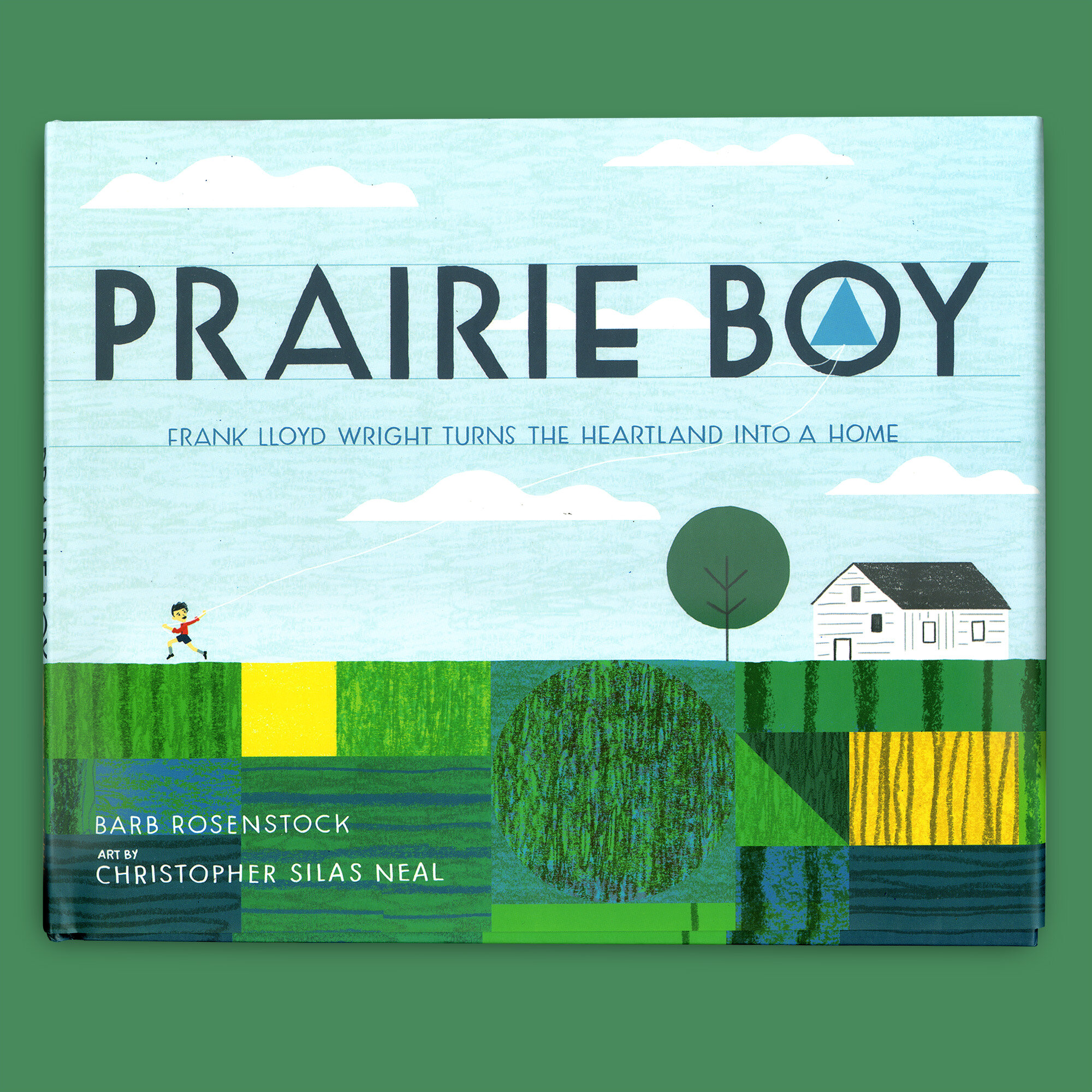
Prairie Boy
0
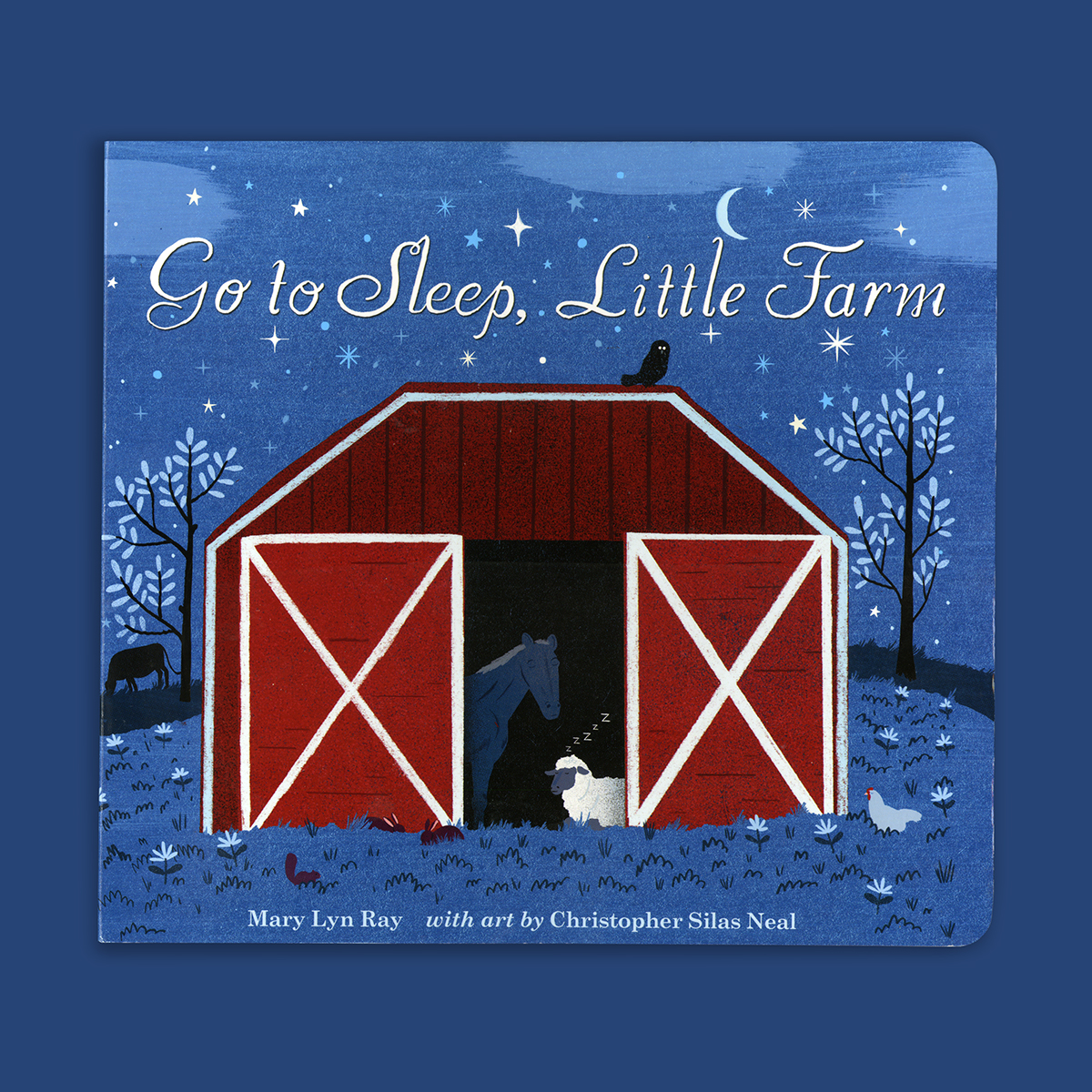
gotosleep
0
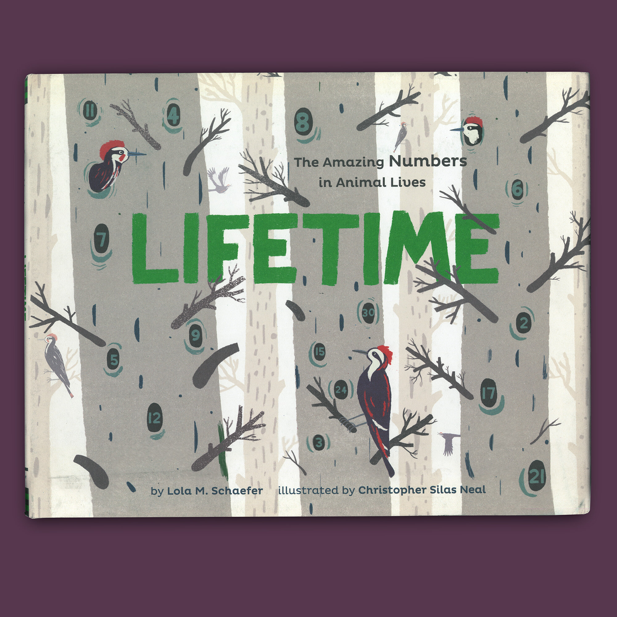
LIFETIME